Training, Tutorials and Templates
OxShef: Charts provides general advice on choosing the most appropriate visualisation for your data and to avoid making common mistakes or pitfalls in data viz. However, we do not provide interactive tools for matching your data to charts (or vice versa).
There are many tools (Excel, Google Sheets, Plotly, Tableau) which automatically suggest charts based on the properties of your dataset. This is possible thanks to excellent research into visual perception theory and machine vision from back in the 1980s through to today.
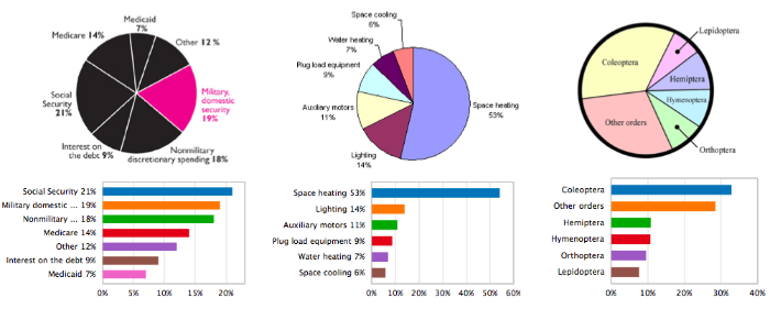
In fact, some tools like ReVision are even capable of taking existing charts and re-designing them to be more accessible and easy to read by humans. The example here shows a number of badly designed pie charts that have been converted into much easier to understand barcharts.

OxShef: Charts maintains a collection of tools and resources to assist you in developing and designing effective visualisations, split into the following three categories:
Choosing a dataviz
Some charts are more suitable for specific purposes than others. In some cases these resources can automate the chart selection process, or at least help exclude some chart options.
Designing good dataviz
There are many best practices for dataviz which radically improve the legibility of a chart, for instance: horizontal barcharts with bars arranged from longest to shortest are significantly easier to interpet than unordered vertical barcharts.
Adding interactivity
Sadly, there’s little general advice for effectively adding interactivity to charts. However, two extremely useful rules of thumb are “Make the least interactive thing that works” (@BrianBoyer) and Ben Shneiderman’s mantra Overview first, zoom and filter, then details-on-demand.